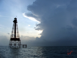
 Jack Howard is known in the southwest Ohio area and abroad for what he describes on his business cards as “Distinctive Architectural Renderings”. We certainly agree! His work was recently featured in an exhibit at the Middletown Arts Center, and we had the good fortune of meeting Jack as well as being the event photographer for the opening reception. Even more recently Jack asked us to help him obtain some high quality images of his work. We won’t share the secret why, but there are apparently some exciting things coming up for Jack! We wish him the best of luck.
Since we regularly encounter people wishing to photograph their own artwork (and often provide that as a service), we thought we might show off a few behind the scenes shots of the project. Please be sure to look through the gallery below. For the benefit of our students, some thoughts on the setup:
– We have dual Alien Bees 800 w/s strobes set at about 1/4 power. Placed at 45 degree angles to the artwork and with the light head level with the art. This setup allows us to photograph the art without getting glare from the glass as the glass reflection bounces off at the same angle it hit. The distance to the artwork isn’t critical, but should generally be about the same distance as the camera. In this setup, it was 6ft or so. The distance does affect the chosen power setting on the strobes though. We adjust power and distance based on our choice of f-stop below. Care does need to be taken to ensure that the flash does not generate other reflections that could be problematic. Note the black drape on the tripod. The flashes caused a reflection off the aluminum leg which was visible in the glass of the artwork. This could have potentially been solved at least some by moving the flashes further behind the position of the tripod but given the color of the walls, we felt that we’d still potentially have troublesome reflections and opted for the black cloth. Softboxes on the strobes or a black flag between the strobe and the tripod also may have helped.
– Camera is positioned to provide an 80mm focal length on a DX sensor, equating to about a 35mm equivalent of 120mm based on the lens we were using. We chose that focal length predominantly because it’s in the range of focal length that provides a minimum of distortion to the image while still allowing a camera position that worked well in the work area. The focal length discussion is beyond the scope of this post, but feel free to Google “focal length for portraits” and read away. Yes, I know we are photographing art. The same distortion physics apply. In art though an improper focal length tends to curve the straight lines in the image. Yes, such problems can be fixed in post-production, but we strive to get the image correct in the camera and use post-production for fixing things generally beyond the control of the camera. You’ll also note the slight downward angle of the camera. This compensates for the angle of the artwork caused by the easel and allows the image plane to be parallel to the artwork preventing distortion. Proper camera position is easily verified in the viewfinder in that if set correctly, the edges of rectangular framed art should be straight (not curved) and parallel to the edges of the viewfinder on all sides.
– 1/160 shutter, f6.3. RAW. ISO100. 10MP. Aperture chosen to avoid an overly narrow depth of field. Occasionally when photographing art or documents, usually as part of a restoration, we have the luxury of a nice flat image which works well with a shallow depth of field. Unfortunately, when shooting art on flexible media, matted and framed behind glass, the surface of the art is often not flat. Thus, a slightly larger depth of field ensures that the entire piece is in focus. You could very easily debate the appropriate f-stop ad-nauseum, but we’ve found that a setting around 6 gives us a nice trade off between the depth of field and the required amount of lighting. ISO100 for the best quality the camera can provide and 10MP for the max resolution. Remember, you can always take pixels away, but you can never add them back.
We shot on a 2 second timer so as to make totally sure there were no focus issues from camera shake and included the gray card in shots numerous times so we had plenty of points of reference for color correction. Camera white balance was set to a “stock” flash correction. Our camera does have the capability of custom white balance and we could have put that to use, but after testing we’ve found we get better results with color correction in post, so that’s one of the few post-processing steps we do. The other is crop, since the artwork aspect ratio almost never matches the camera aspect ratio.
We hope you found our “photo-geek” dissertation useful! Questions and comments are welcome! – sales@weigoldphotography.com


